A professional graphic designer located in Chicago, IL. I have experience working with various design agencies, companies and in marketing departments. I have a well rounded background with branding/identity, digital, web and print that I believe would bring value to your business.
I want to learn about your business and become a part of its growth. I know I can provide the quality of design that will benefit your company. Let me use my experience to help influence it's success!
Industries: Marketing, Healthcare, Health/Fitness, Apparel, Live Events, Food/Diet, Beauty/Hair, Non-Profit, Corporate Leadership, Union Organizing, Technology (varies), Home (Decor, Kitchen/Bath).
Skillset: Graphic Design, Logo Design & Branding, Social Media Design, Marketing Design, Email Design, Web design, UI/UX, Infographics, Presentations, Video Production/editing and motion graphics.
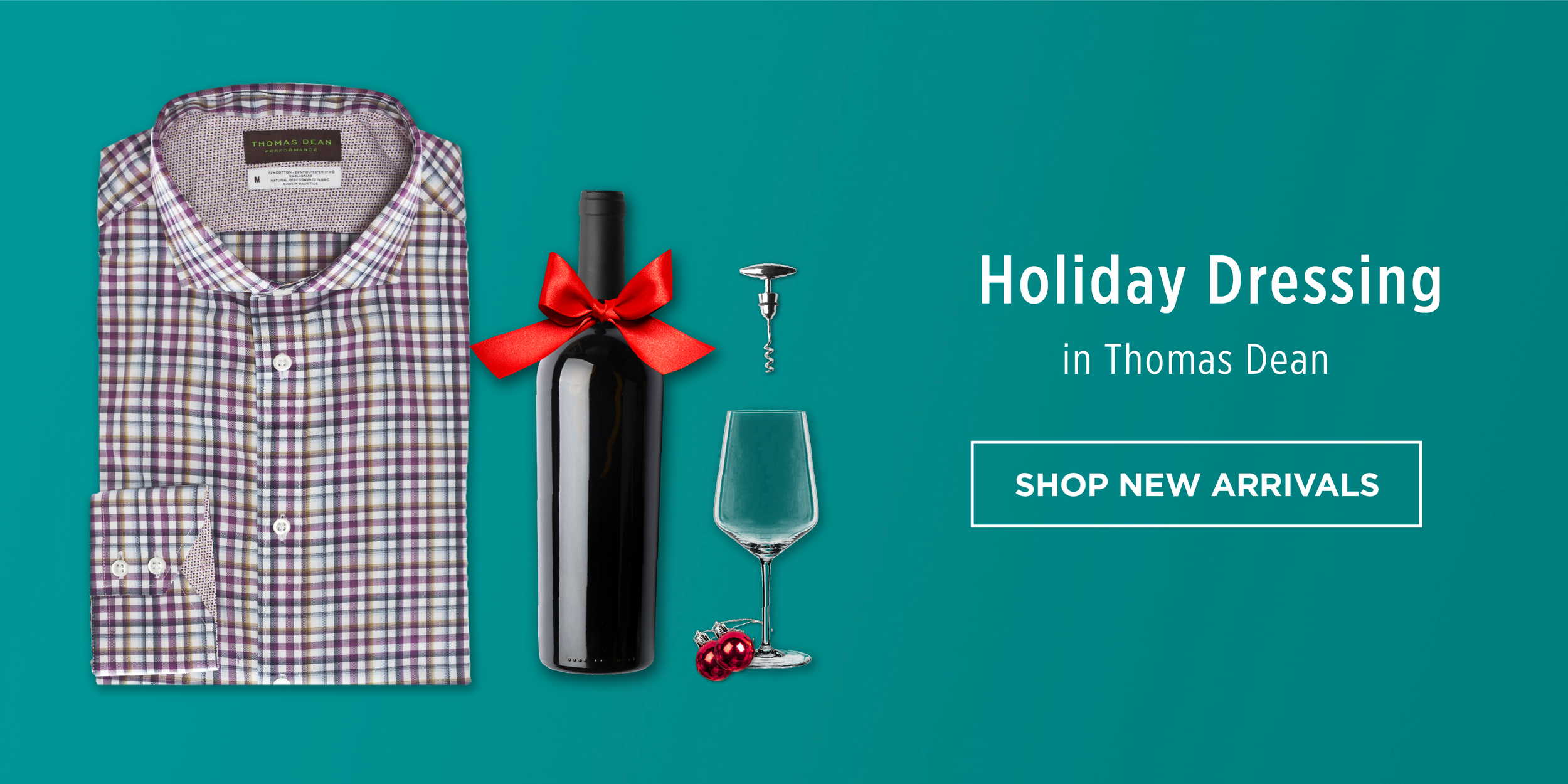
Campaign for Men's clothier Thomas Dean Co. Home page design and accompanying email. Limited budget and no access to models for the season? No problem. Worked out this design campaign concept to relate to the sense memory of each occasion for the customer. Gives each set an emotional OOMPH! Not to worry…No shirts were ruined with wine or BBQ sauce during the making of these images.
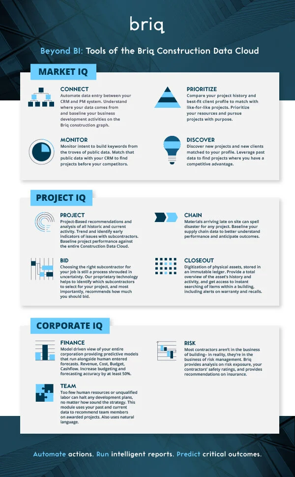
Briq is a great technology client that I have enjoyed working with and helped the development of its brand assets.
Briq’s core mission is to help general contractors and subcontractors drive more revenue, stop fee erosion, enhance profitability in projects, and freeze overhead and administrative costs. Briq’s Construction Data Cloud gives GCs and Subcontractors confidence that the decisions they make will have a material impact on the performance of their projects and their organizations.
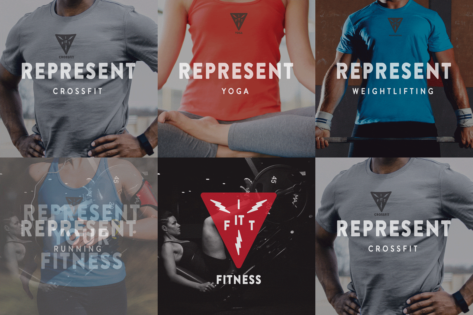
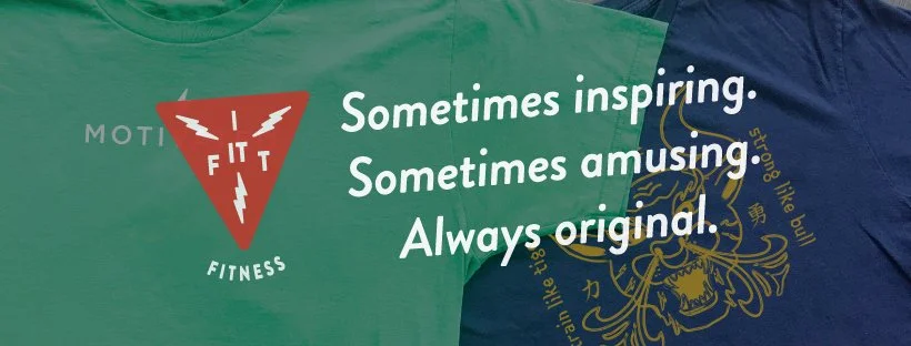
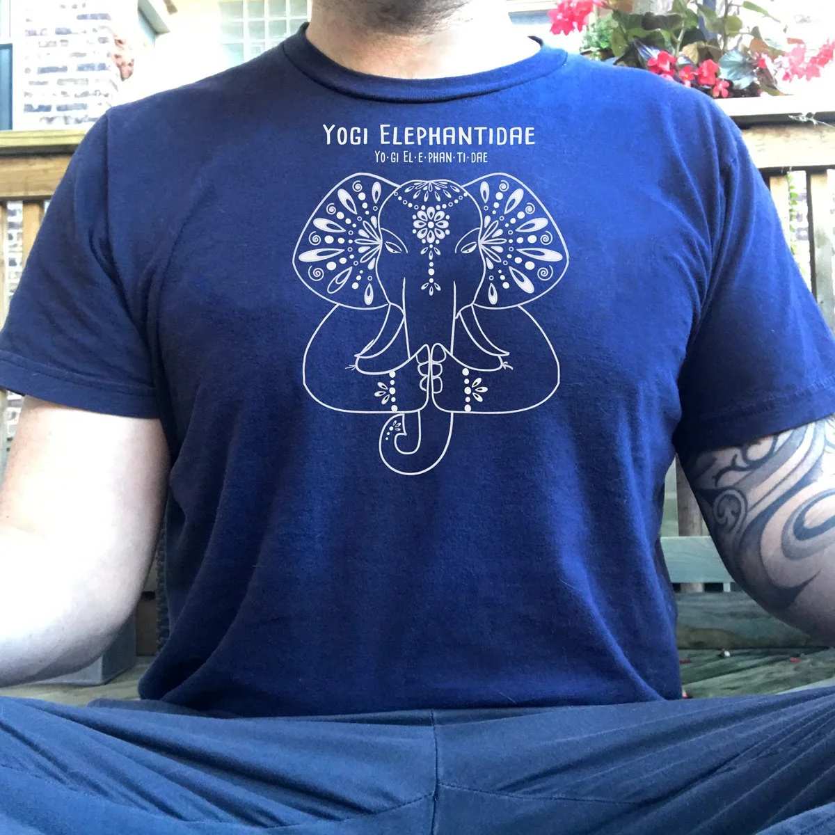
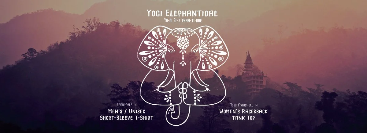
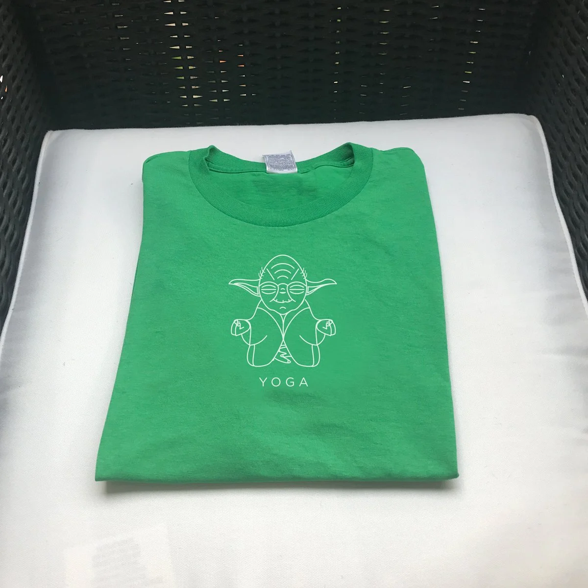
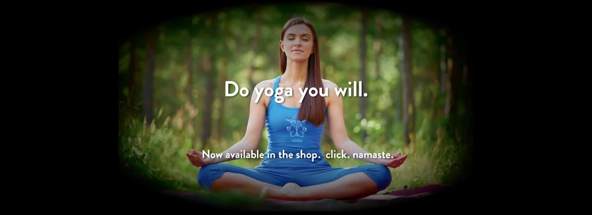
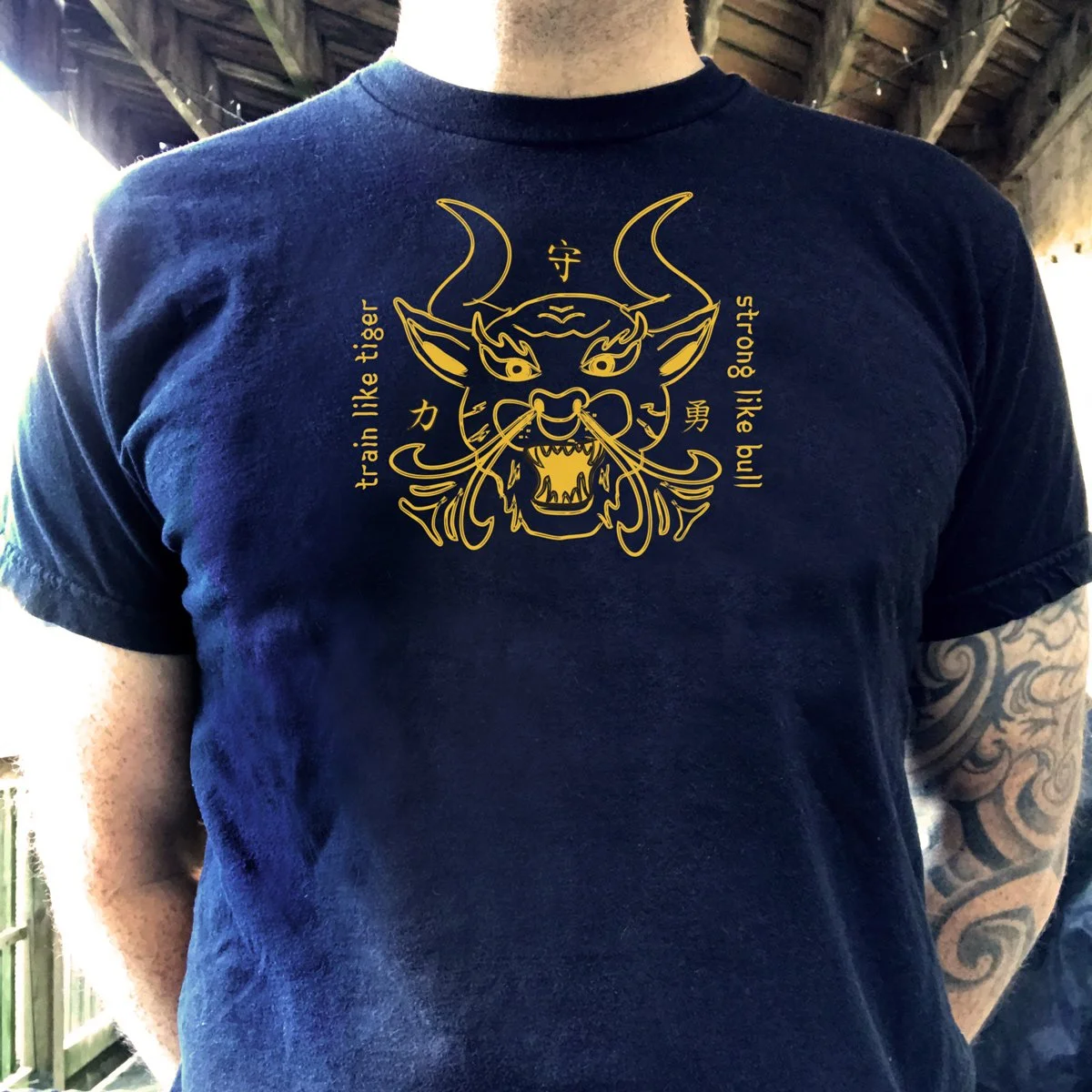
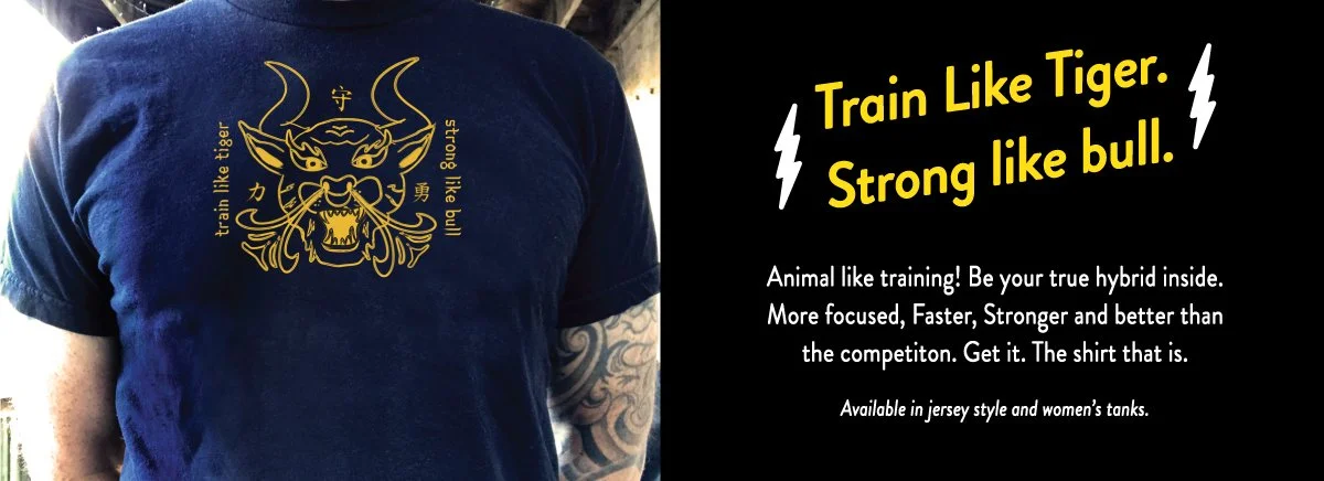
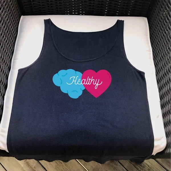
Fit It Fitness. A side gig. I am a creative individual who enjoys living a healthy lifestyle. I started this as a fun side hustle and to learn how to sell online. Inital Idea was to keep it to simple inspirational phrases on shirts…BORING! Of course i couldn’t help but give in to my true creative impulses. The result is some of what you see here. To be continued?
In this gallery you will see the shirt design with the accompanying home page and social/home page ad.
Logo/shirt design for the 2022 Race for the Cure at Soldier Field.
A good cause that I was honored to create a logo to help celebrate the 25th anniversary of the Chicago event. Done by hand with space to include the official logo. Given to higher donors of the event as part of the rewards package.
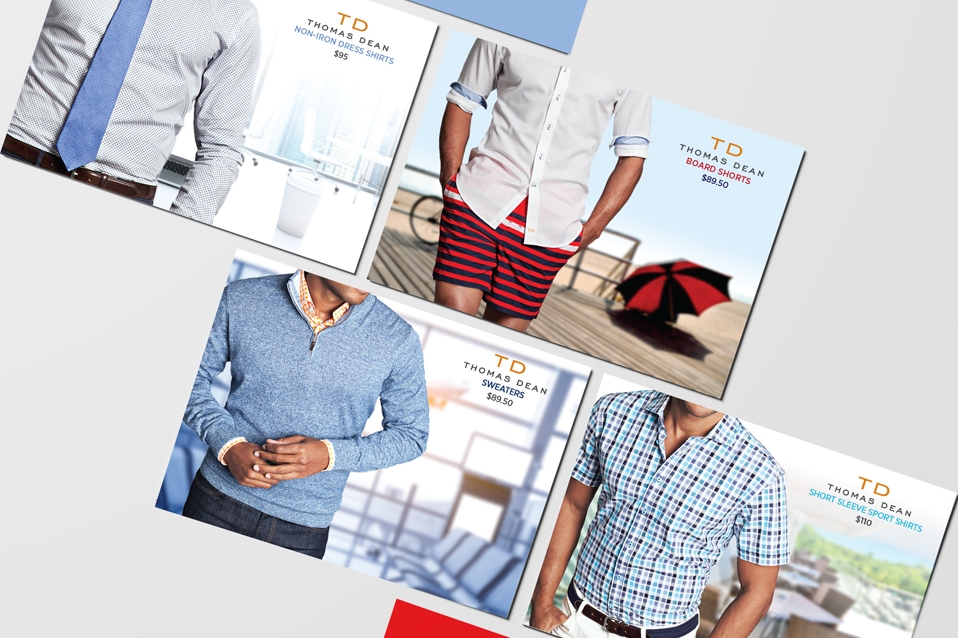
Concept and design for Men's clothier Thomas Dean Co.. A set of promotional postcards to their VIP customers.
All images are photo comps. The models originally shot on gray backgrounds in a studio then placed into stock photos to add some romance to these amazing, high-quality clothes.
Each card includes an offer and a "story" on the back.
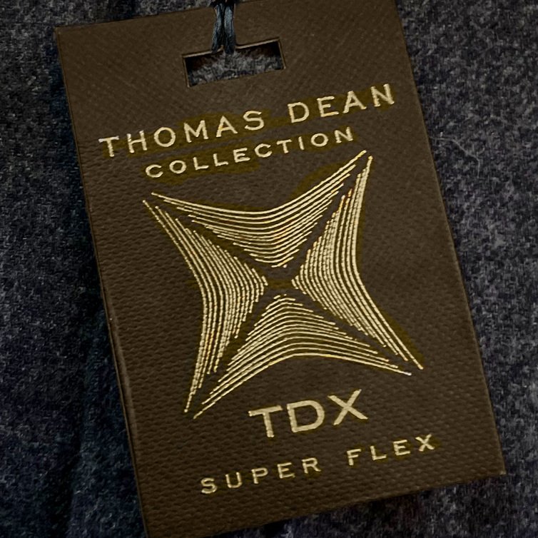
TDX logo for Thomas Dean Apparel. Developed to represent the detail of this inventive new fabric and its response while in use.
Created in response to the market demand for Men’s pants with superior stretch fabrics that keep their shape. Typically, as fabric stretch increases so does the tendency for fabric growth or shrinkage. By combining two different LYCRA fibers in core spun yarn, you get the best of both worlds. The result is a revolutionary stretch fabric that is very comfortable to wear and retain their shape and fit over time.
Briq is a great technology client that I have enjoyed working with and helped the development of its brand assets.
Briq’s core mission is to help general contractors and subcontractors drive more revenue, stop fee erosion, enhance profitability in projects, and freeze overhead and administrative costs. Briq’s Construction Data Cloud gives GCs and Subcontractors confidence that the decisions they make will have a material impact on the performance of their projects and their organizations.
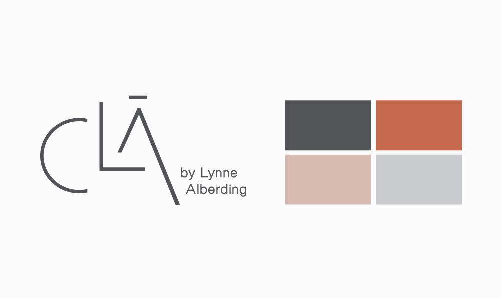
CLA is the brand alias of elite Chicago Physio instructor Lynn Alberding in Chicago, Illinois. CLA ( pronounced clay ) is the program developed by Lynn for her clients.
I was tasked with creating a custom mark that best represents her unique talents as an instructor. She wanted to represent form, flow and elite in her mark. As her education and skillset has grown she wanted to represent herself to an audience that would appreciate her knowledge and experience. This mark also gives here the ability to expand into a brand that would represent the different facets of her studio as well as future product development.
Whether you’re new to cooking or looking for the recipes your Italian mother used to make Liz is the right woman to teach you how to cook. Discover the joy of simple Italian cooking by learning the basics and using her recipes as your guide. Soon you will gain confidence and inspiration each time you cook.
Hand drawn logo with a retro vibe. The discussion with the client was to give a classic aesthetic that implied Italy and cooking without being overt (flag, forks knife etc.). Hand drawn to represent the hard work, real ingredients and "no cutting corners" mentality to her cooking, yet still representing simplicity.
Color palette developed based on old Italian signage and the colors often found in the ingredients of these memorable recipes.
Recipe cards developed that will be available to premium subscribers. Branded apron soon to be available for purchase.
Redesigned logo for CENTERED in Chicago. An amazing Pilates/ movement studio that was developed by its 3 owners. All highly educated, experienced and passionate about helping its clientele by alleviating all the aches n pains of daily life. A flowing mark to represent fluid movement with colors that are intended to represent balance, serenity and self-awareness. Logo and business card design.
3rd image is window treatment design with the updated logo.
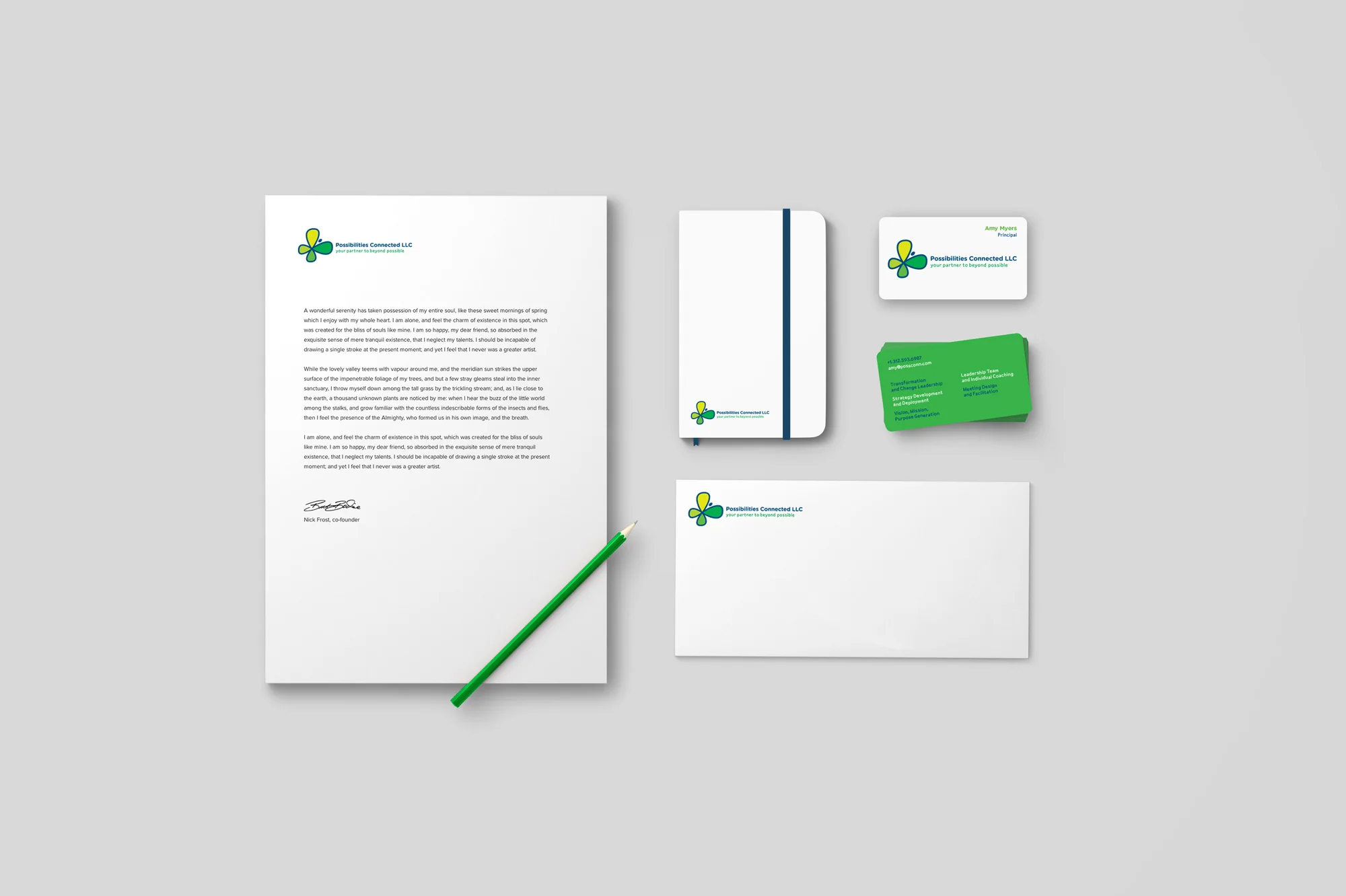
Leaders often need the support of a partner when championing high-stakes transformation efforts across their companies. Possibilities Connected is one of the best; blending the core capabilities of a classic consultancy, with a deep understanding of business as a human experience, so that what the client envisions actually becomes reality.
A mark to represent the expansion, growth and transformation that can take place when Possibilities Connected is your organization’s partner.
Briq is a great technology client that I have enjoyed working with and helped the development of its brand assets.
Briq’s core mission is to help general contractors and subcontractors drive more revenue, stop fee erosion, enhance profitability in projects, and freeze overhead and administrative costs. Briq’s Construction Data Cloud gives GCs and Subcontractors confidence that the decisions they make will have a material impact on the performance of their projects and their organizations.
Logo and branding design for a high-end outdoor environment designer. PITCH Concepts is a Chicago-based full service outdoor design/build firm with a focus on customized urban rooftop decks and backyards. Led by principal Baky Soumare, PITCH has designed and executed more than 100 projects over the last six years.
Package design and accompanying booklet design for Plan Z's Diet supplement. Designed following brand guidelines.
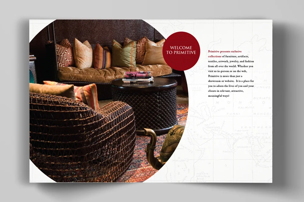
A booklet designed for Primitive in Chicago. A client that sells unique and collectable items for both the traveler and treasure hunter. With items sold from around the world, the goal was to design a booklet that represented the class of this company as well as it’s multicultural aspect.
Each section is broken down with a unique icon that represents each culture along with imagery of the incredible pieces that Primitive curates.
Home page develop for QUANTUM HEALTH APPS.
Their revolutionary Quantum Biofeedback App will stimulate the body with certain frequencies and then measure the bodies response to these frequencies.
The basic premise of this new kind Biofeedback is that everything is in a natural state of vibration.
Concept and design for Men's clothier Thomas Dean Co. Christmas 2017! THE TWELVE DAYS OF GIFTING.
Without the benefits of location model photography, developed a line of emails, related homepage and social media. Worked across all platforms. Using romantic Christmas related images, type and icons. Turtle Dove strategically placed throughout to help with the lyrical aspect. On the 2nd day of Christmas….you get it.
Custom logo for "GUY & DOLL". A talented music duo located in Chicago. Designed to encompass the variety of instruments, as well as song titles, they have available at their disposal. They take the cover band to the next level. A massive repertoire of songs knowledge..and good taste. Can you ask for more? um. no.
Created shirts, stickers and a website soon to come.
Logo design for local, custom home builder. A client that creates high-quality, luxury, victorian homes and he wanted a logo that would best represent his signature style. A designer that takes alot of care in even the smallest details and I wanted to represent that in his logo.
I included additional concepts to help show part of my design process and I felt they were worth sharing.
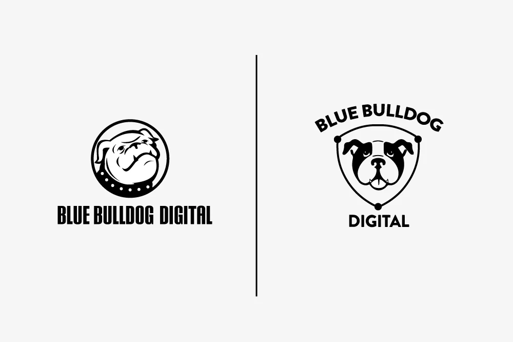
A custom logo design for Blue Bulldog Digital. An original icon based on the owners dog and dedicated employee, Walter.
A large portion of of BBD’s client base is union related. They are dedicated to businesses that support the union cause. With this knowledge I created a badge style logo inspired by the many union logos that BBD helps support.
I included a few other of the initial design concepts that i thought were worth sharing. Shows a bit of insight in my process.
These logos are getting older, but still worth sharing.
If you'd like to know more about any of them. please feel free to ask.
A variety of package design samples. Some involved rebranding and logo development as well.